Background
Scale-Up.iO is a SAAS orientated recruitment agency based in the UK. The director of the business approached me to request that his old logo (pictured right) was brought up to date with modern trends. In the brief, he requested that the new logo utilised the same colour palette and visual identity.
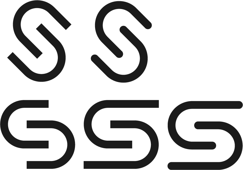
As with any logo/branding redesign, I set out to arrange meetings with the client to discuss how to give Scale-Up.iO a new lease of life. Following these calls I created a series of initial ideas, shown below.
Initial concepts
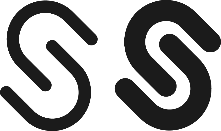
I wanted to keep the same form factor that the old logo had, featuring sleek and strong edges. After showing these to my client they had a complete reverse on their stance of sleek, minimalist design with simple edges and these weighted lines.
