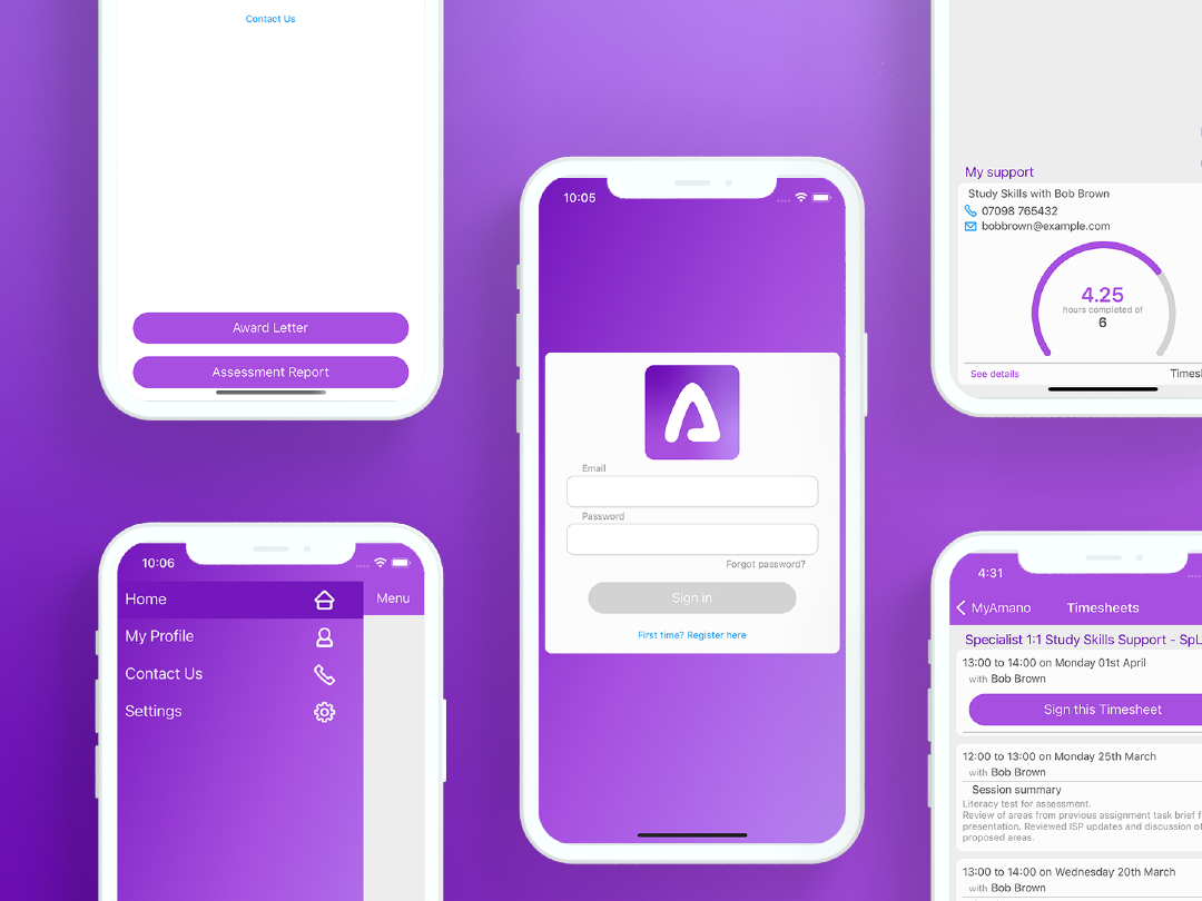
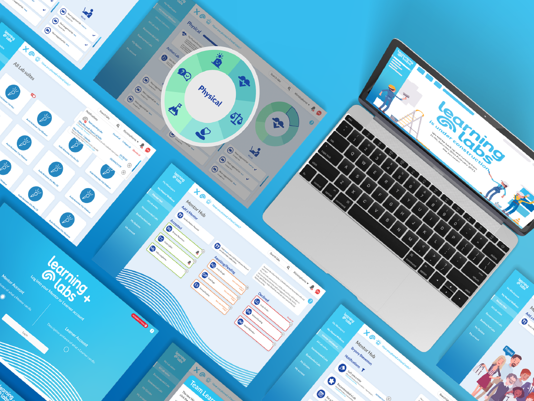
Learning Labs is the holistic approach to mental wellbeing and inclusivity in one digital platform based in the Disabled Students Allowance sector. Producing e-learning for education and the workplace covering mental wellbeing, assistive technology, accessibility, study skills, career skills and more.
Initially, when I started working for eQuality Solutions one of the first things I noticed was that their old Learning Labs logo did not match the other company logos.
The brief was simple, develop and create a brand new identity for Learning Labs which was in line with the exsisting two companies. Additionally I wanted to reflect Learning Labs neurodiverse development.
The first thing I did when producing the new logo was decide on a new font. Looking at the existing company logos and the brand ethos I decided to go for a more playful rounded serif font. Additionally I decided to make the wordmark all lowercase in order to create cohesion between the other two brands and keep that friendly feel to the logo.
I played around with the idea of including a silhouette of a head but felt it too impersonable. I wanted Learning Labs to have a personality and felt this faceless silhouette did not lend to that. Additionally I further explored the idea of creating a abstract shape which could be interpreted as a brain, which was a call back to the way Learning Labs has been built and developed with neuroscience backing.
Final Learning Labs Logo
Geometric break down of Learning Labs' logo
Implementation of logo on various merchandise

